Video Art Aesthetics in Horror Movies
I am such a video nerd that whenever I see video art aesthetics in a feature-length film, my brain lights up. A stupid grin crawls across my face, even if it's just a title sequence. It might be because it's a bit of a rare occurrence these days; outside of experimental works, you just don't see that look deeply explored, and especially not in long-form works for (relatively) mainstream audiences.
One genre where I notice it cropping up more than most is horror. Given that it's October, it's almost Halloween, let's dive into the video art aesthetics of horror movies.
Film v. Video
What am I talking about when I say "video art aesthetics"? Well, broadly speaking, I mean aesthetic techniques that come out of working with video (as opposed to film). This includes keying, colorization, video feedback, interlacing artifacts, scanlines, glitches, video-equipment-as-aesthetic-object. Get the idea?
While accomplishing similar end results ("time-based media", ugh), video and film are very different processes. You just end up with different results. Think of slow motion: early video slow motion is stuttery, like a frame-by-frame recreation of what happened. This is because the slowdown happens post-recording. Film slow motion is overcranked at the time of recording and can give silky smooth motion.
Douglas Gordon's 24 Hour Psycho is a good example of this. The Scottish artist took Hitchcock's proto-slasher and slowed it down to stretch the runtime across a whole day. But it is a post-hoc effect. It's stuttery. Funnily enough, it actually runs faster that I thought it would. When someone tells you that they stretched 109 minutes over 24 hours, I was expecting a sequence of stills. A slideshow. There's clear, consistent motion here; but it's a look that's not entirely "film". Not anymore.
24 Hour Psycho is horror film taken to a video art realm, but let's flip it around: video art working its way into horror film. Timing here is pretty crucial. As video equipment became increasingly inexpensive in the late 70s/early 80s, mainstream movies were going through a horror boom. Feeding into this cycle was the rise of MTV and more experimental video techniques being mainstreamed out of galleries and into homes in the form of music videos. As influences fed on each other, feature films looked to ape the aesthetics of video art-infused MTV.
Altered Visions
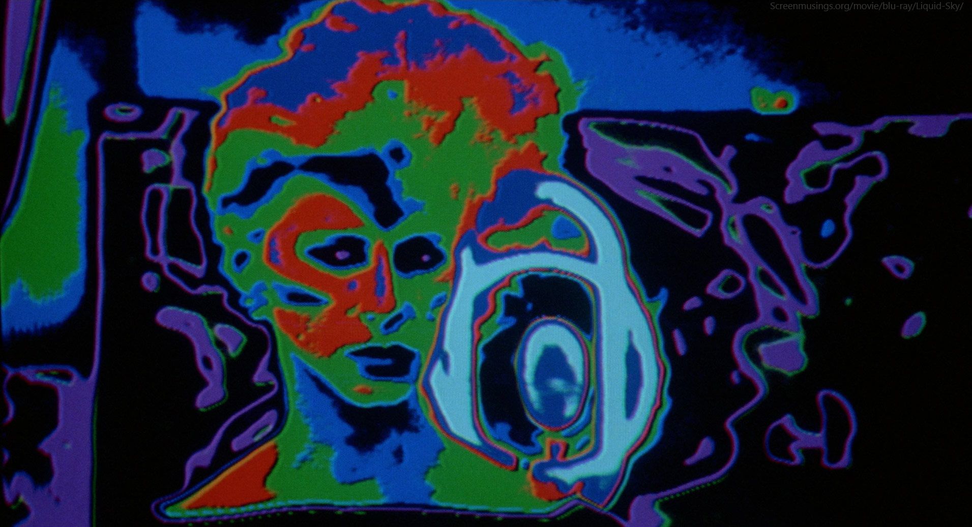
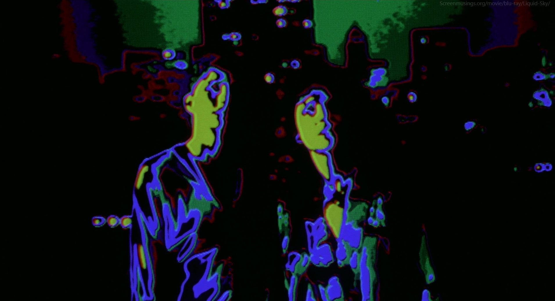
A good example is 1982's Liquid Sky. In addion to being the Most New Wave Movie Ever, the plot involves drugs, club culture, and murderous aliens. Depicting what those aliens saw is accomplished with the use of multi-layered hard keys blob-ifying figures into bright, concentric colors.
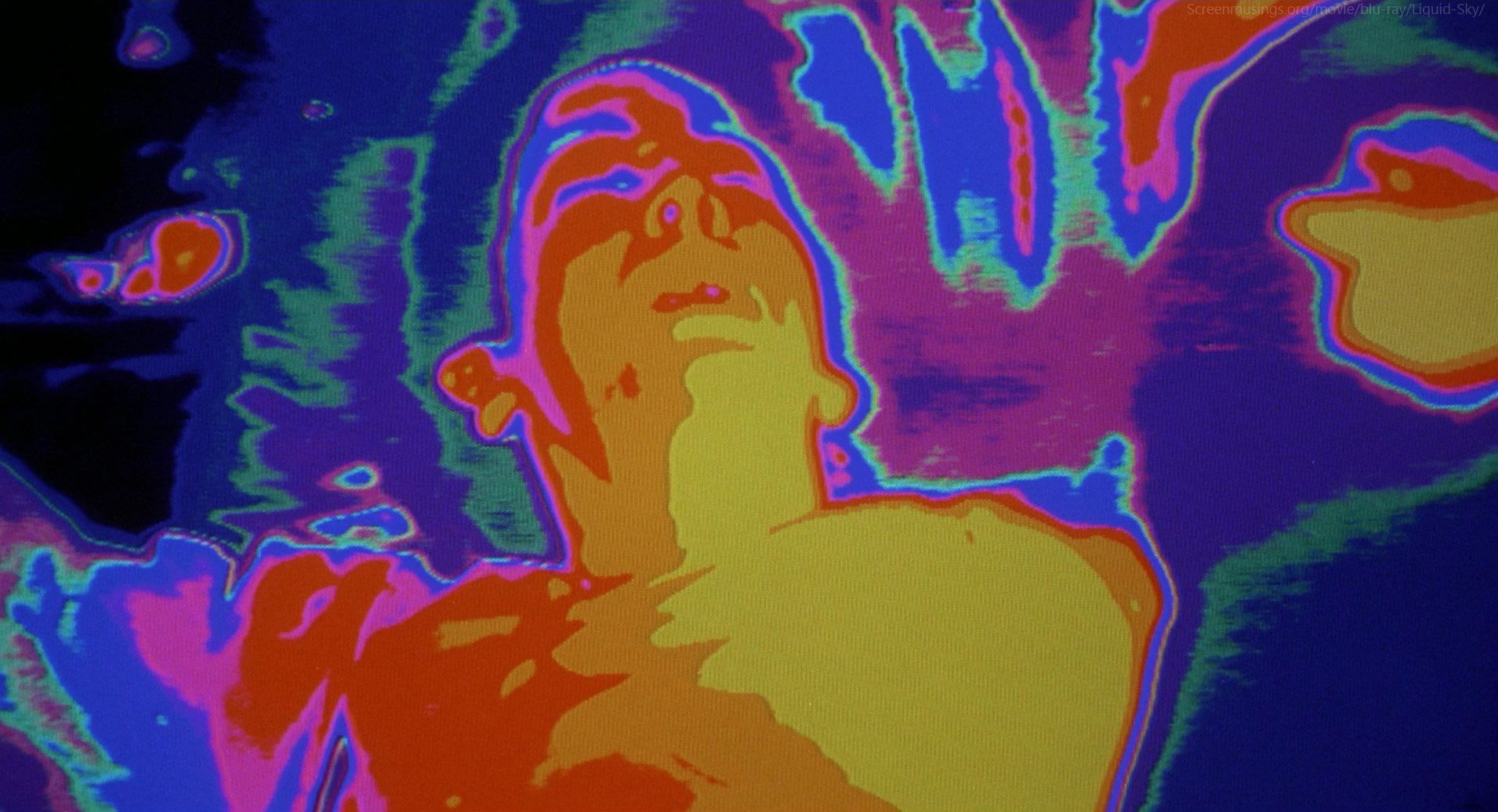
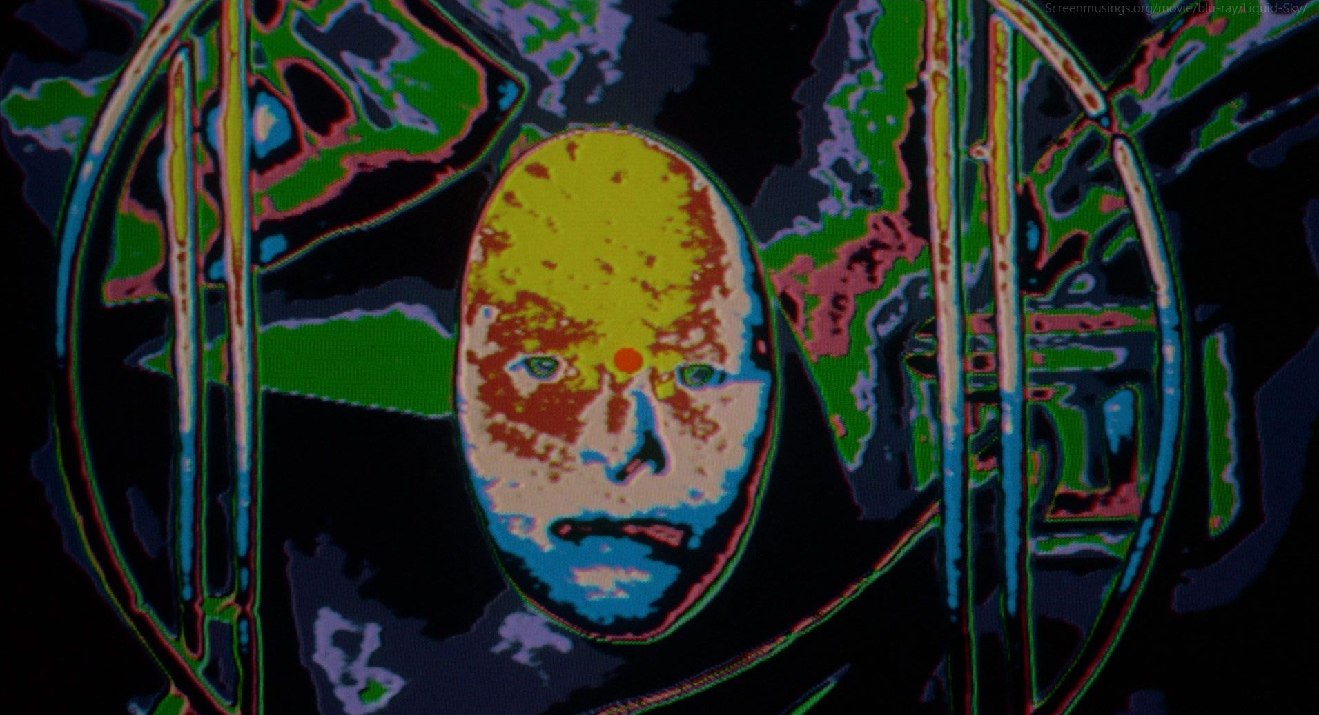
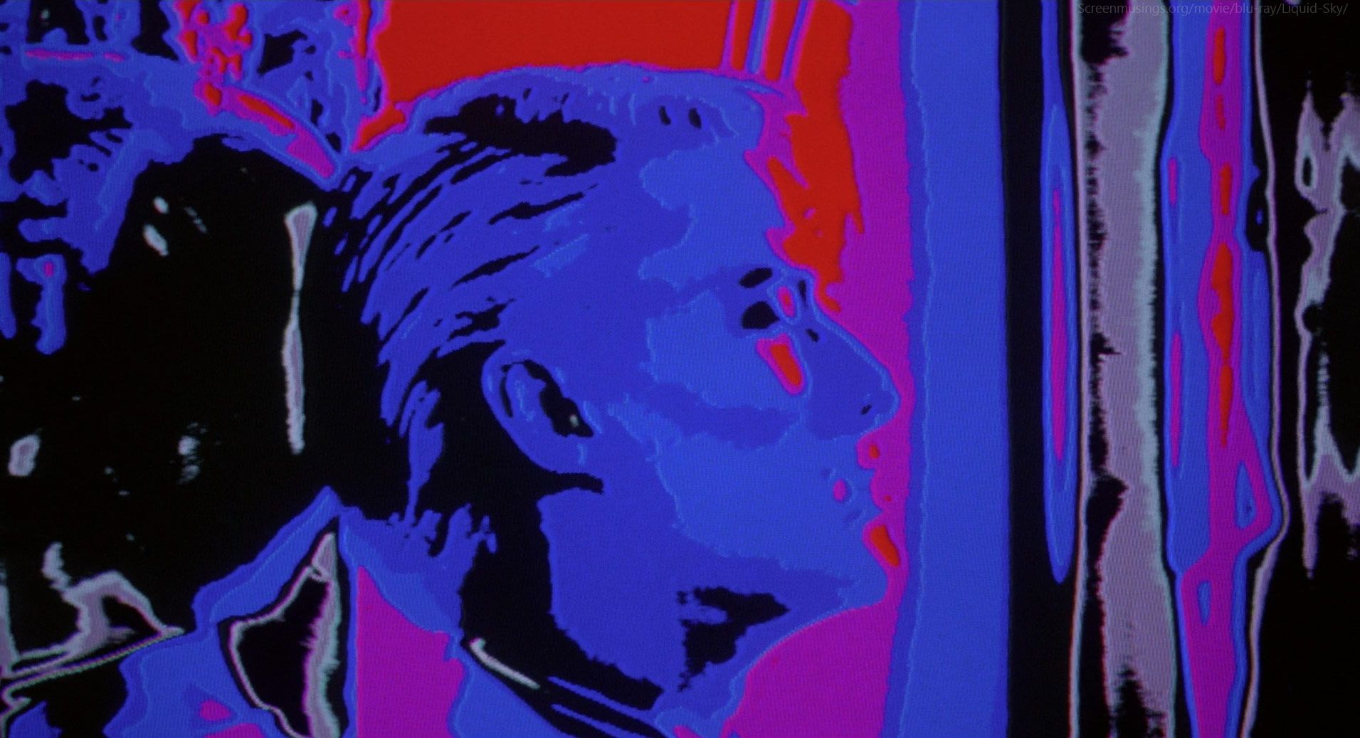
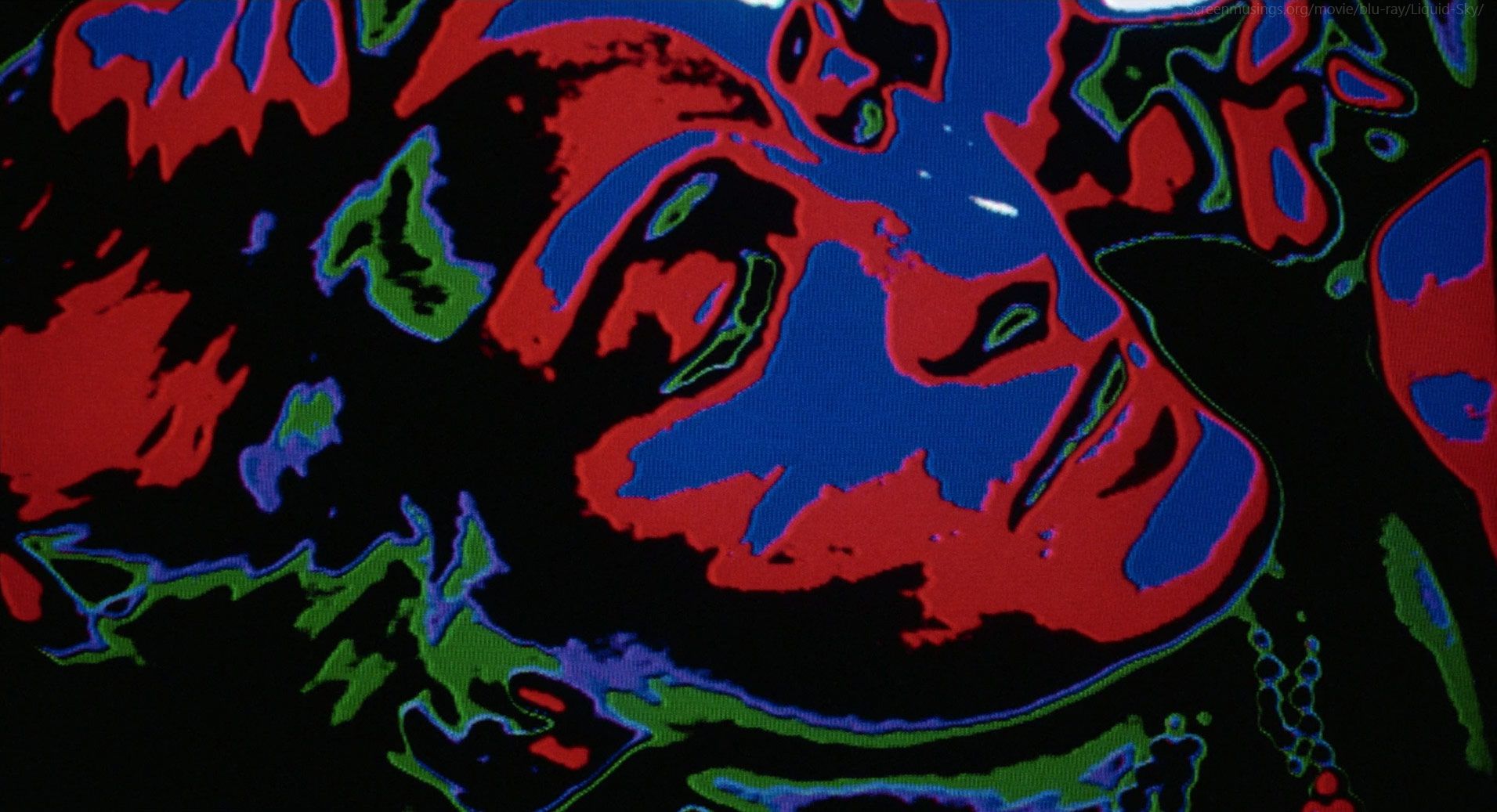
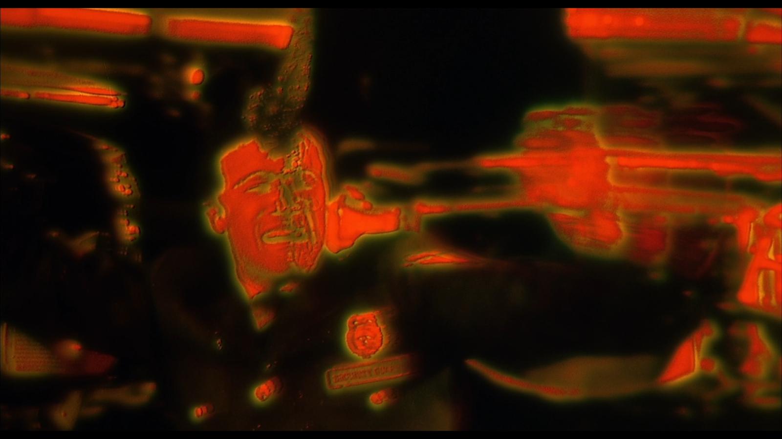
Five years later, a much more mainstream film would use a similar effect to similar ends: Predator. Predator's heat vision was actually shot with a heat vision camera. It's not a post effect, though the aesthetics are roughly the same. Using the heat vision camera proved to be an interesting challenge, though:
But it was a low res image, half standard video res at the time so it was about 250 lines and it had this sort of natural decay because of the heat – it would actually heat up the sensor a little bit and then it would slowly decay. That gave it all an interesting abstract, impressionistic look. I was really worried that people would not know what they’re looking at, so I was like, ‘Okay we’re also going to have to shoot a filler background and combine them.’ To do that, it had to be shot from the same perspective so we worked out a beam splitter where the heat camera would point down onto this 45 degree angle mirror and then shoot out horizontally and then behind the mirror we’d have a film camera shooting straight to it. We set these two images, the heat image and the optical image, and then manipulated the optical image. It was essentially a blue negative image icon made from that but it had all the trees in it so you remained oriented, you knew what you were looking at. - VFX Supervisor Joel Hynek
This is a good example of using film techniques to incorporate a video effect. It's a live optical composite. Would I have approached this problem this way? Absolutely not. But it does make me want to investigate those kinds of film techniques because they sure sound handy.
While both of these examples use altered visions to depict how aliens "see", stylized, color-shifted looks like this tend to be reserved for psychedelic sequences in feature films. Frank Henenlotter's 1988 horror comedy Brain Damage dips into the video art well to show a drug addled protagonist views his world.
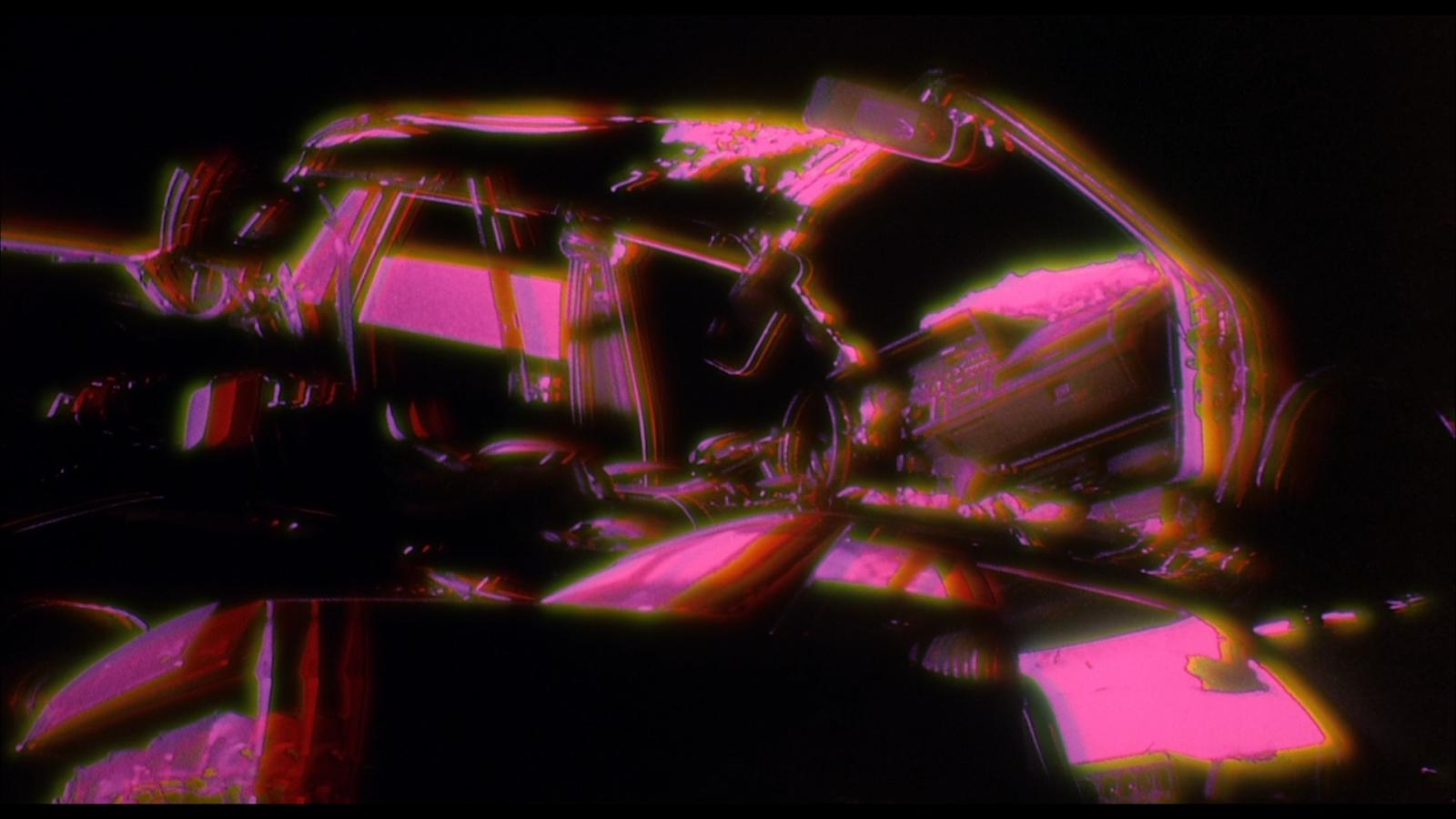
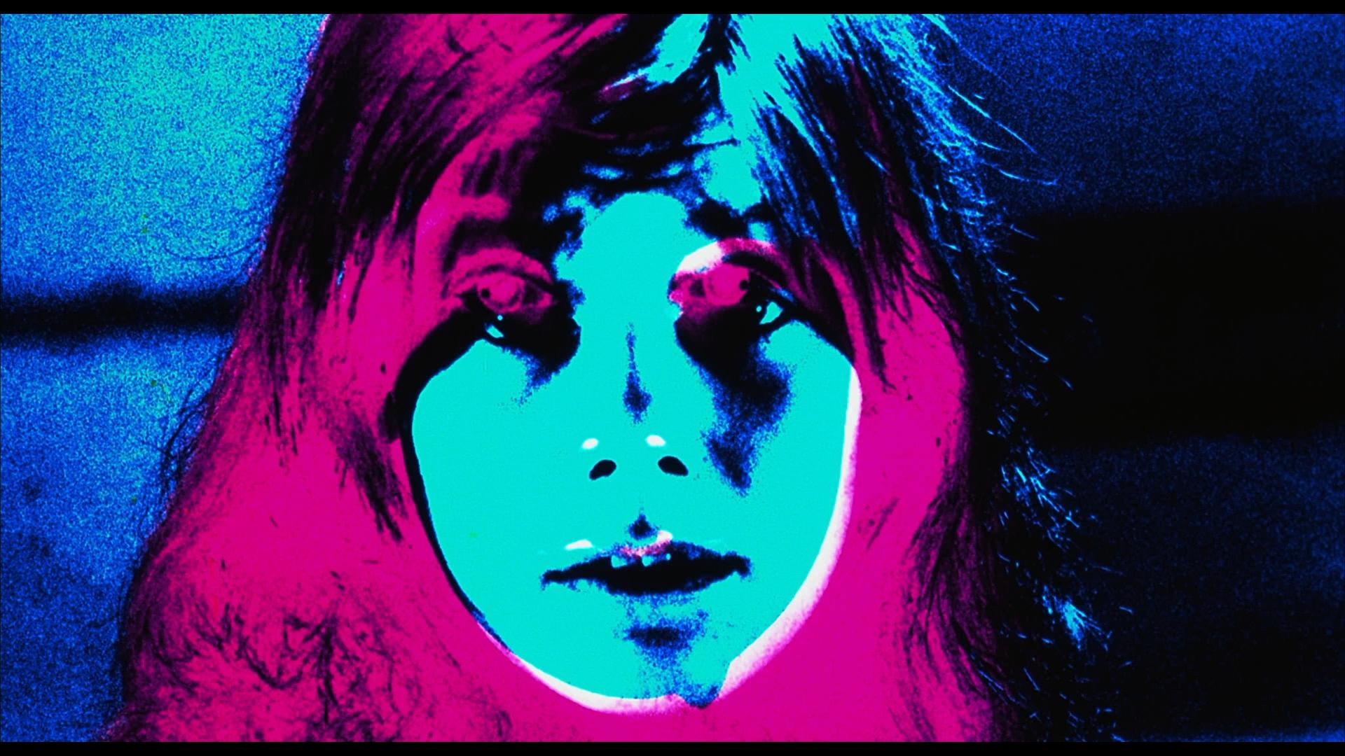
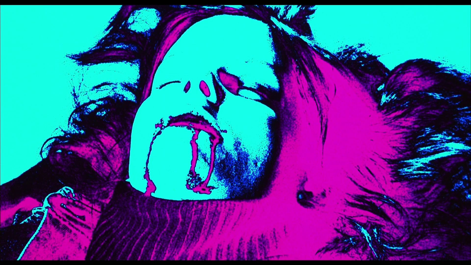
I love these compositions. They have a very screenprint quality to them. It's both referential to a 60s concept of psychedelic image processing, but they also have a kind of grit to them which suits the late-80s New York City setting for the film.
The Fantasy of Chroma Key
In addition to psychedelic sequences, non-drug fantasy/dream sequences have incorporated video art aesthetics to get their message across.
Chroma keying (removing one color and replacing it with another image), has been in use for over 70 years. The process on film is highly involved, requiring high contrast film prints and multiple composites to get the effect. Video equipment makes this process much, much simpler. In 1973, video artist Peter Campus showed that it can be used as a surrealistic artistic effect with his work Three Transitions:
Horror films that heavily incorporate fantasy elements, often use chroma keying for its otherworldly qualities. The technique makes it quite easy to transport characters to other locales or construct abstract compositions.
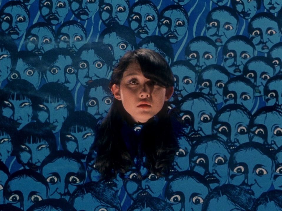
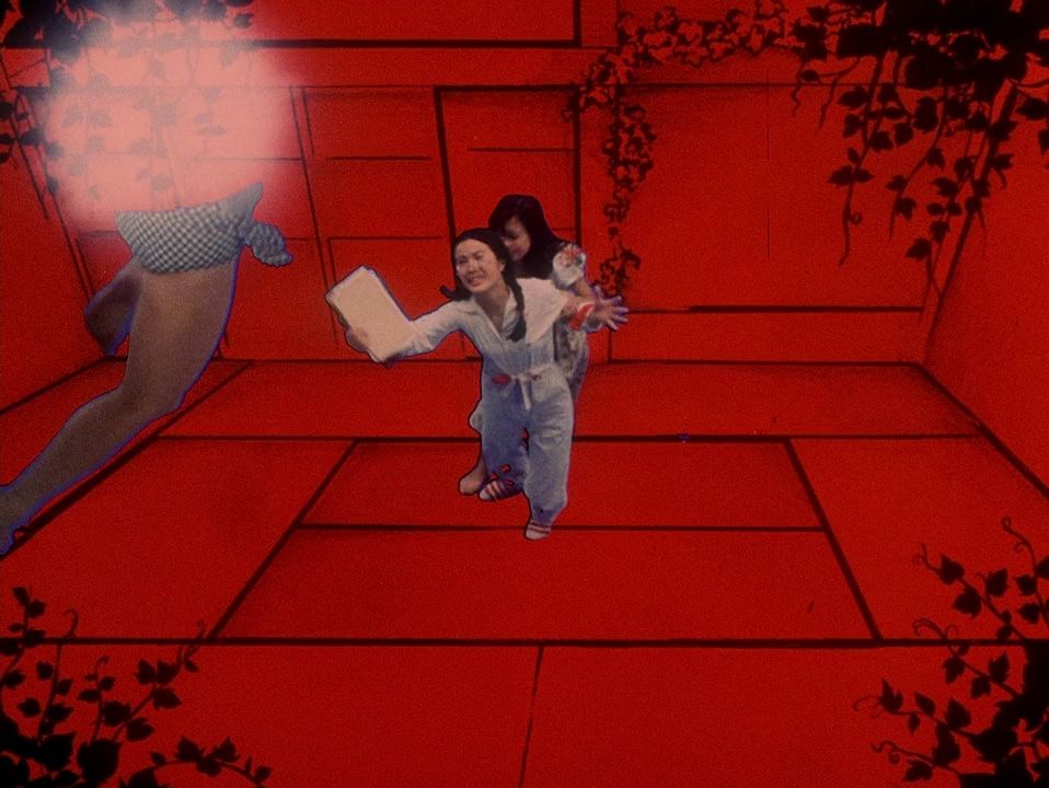
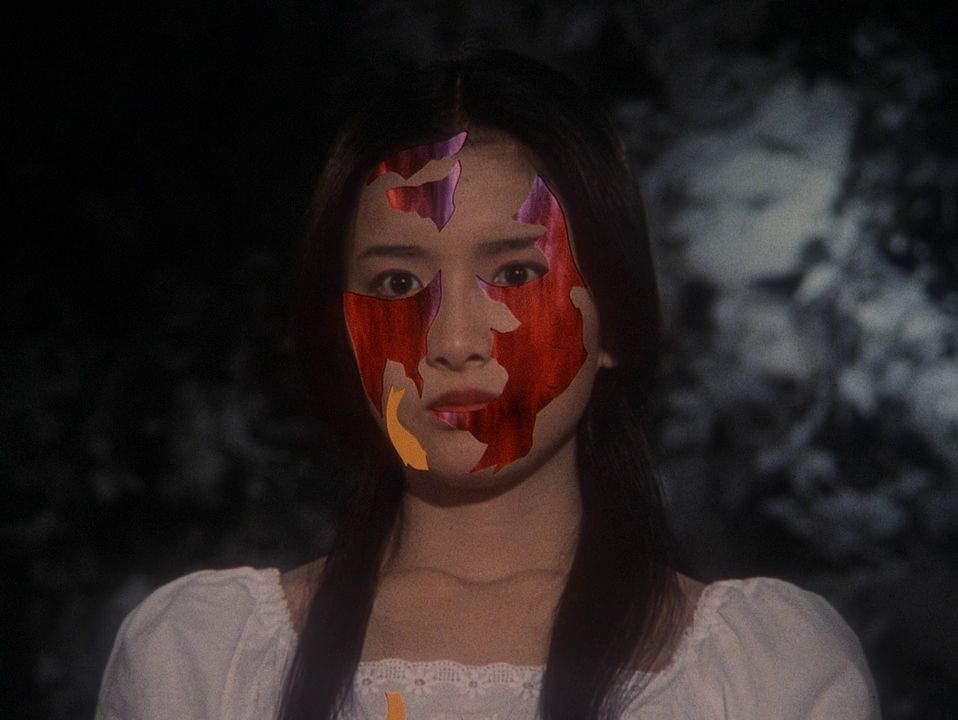
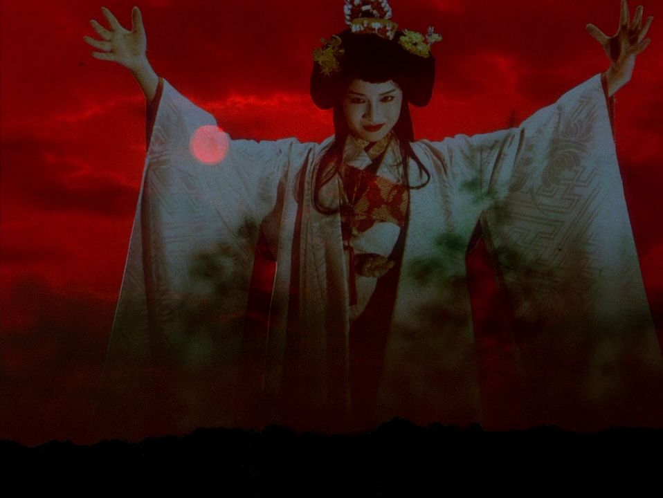
1977's House makes extensive use of chroma keying to achieve its fantastical visuals. Multiple layers of chroma keying are often employed to create an abstract collage of moving, severed body parts.
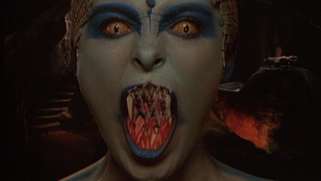
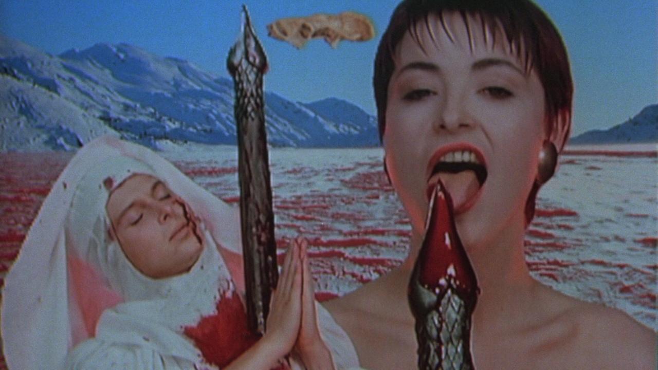
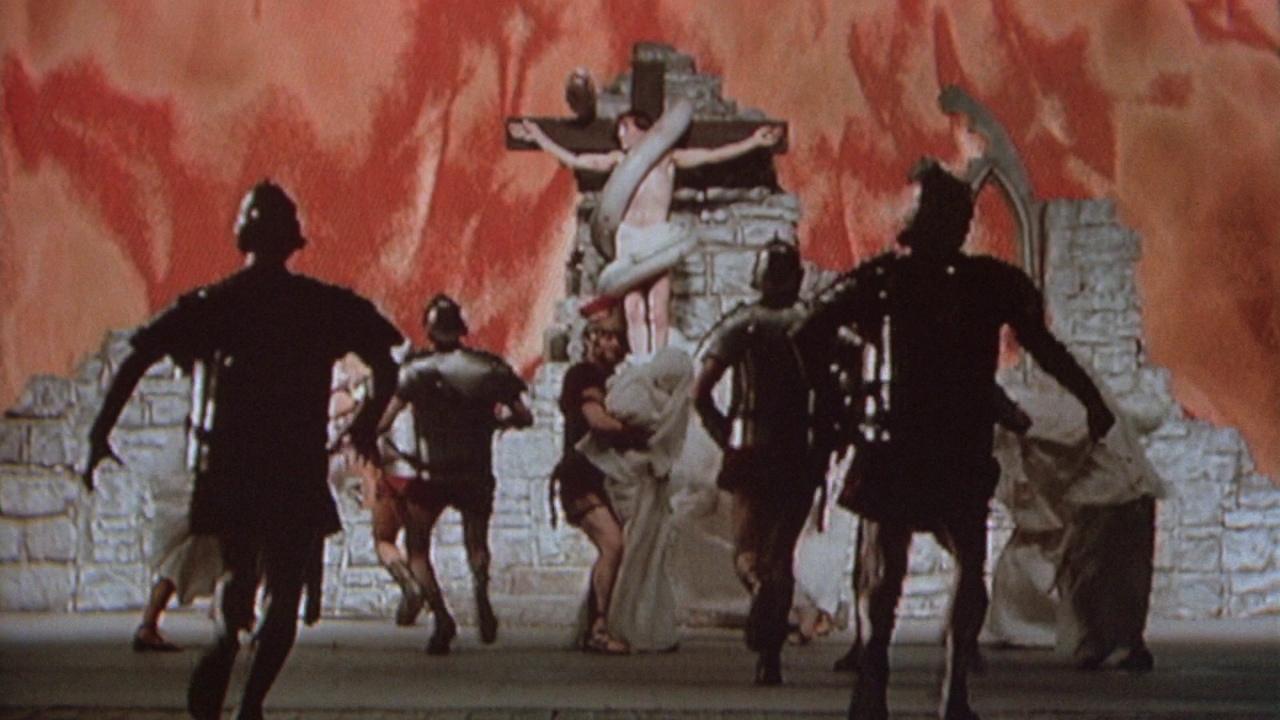
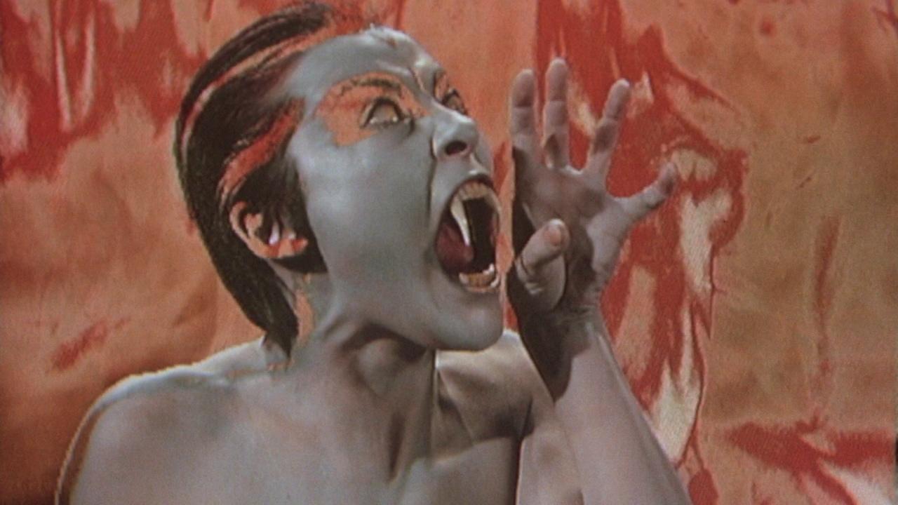
In 1988, Ken Russell employed a similar approach in The Lair of the White Worm. In order to show fantasy sequences of snake-worshipping chaos, Russell used multiple chroma key composites with processed background imagery. The result is very surreal, albeit very 1988 music video–but in a very fun way.
The Horrors of TV
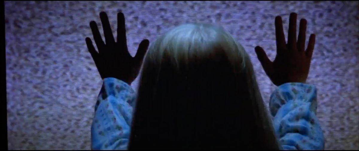
Where some scary movies treat video art aesthetics as pure visual, others approach it as a conceptual horror. Poltergeist (1982) famously begins with a child being sucked into a TV. Aesthetically, there isn't much here beyond the look of TV static; which at this point, is as vintage as analog video synthesis. It also has some heavy use of strobing, which is fairly common in experimental film works.
Halloween III: Season of the Witch takes this further and turns TV into a murder weapon. The opening credits are lovely macro shots of CRT glitches and blown out scanlines, culminating in a hypnotic strobing.
One interesting aspect of shooting the graphic was that [director] Tommy [Lee Wallace] wanted some occasional static and video breakup to it. This posed a problem, since the monitor we were using was being fed directly from the computer, and it produced a consistent, stable image no matter what we tried. What we ended up doing was piping the video through the wireless link of a Steadicam monitor system. We added video glitches by messing with the antenna system on the unit! - Title Designer John Wash
This is a technique I've used in my own work. Cheap wireless video transmitters turn out some very beautiful glitches when you mess with their antennas. The process is very tactile (if unpredictable) and can be "played" for live performance.
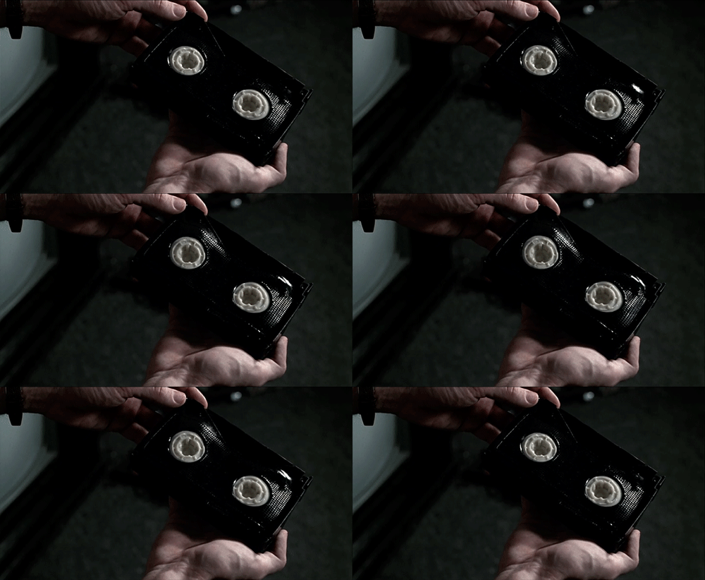
A year later, David Croneberg released Videodrome, an absolute love letter to video in all of its formats. The film has a lot of macro shots of video technology, but where it really interfaces with video art aesthetics is video sculpture. Television sets inflate and consume. Pulsating betamax tapes become artistic objects. The media itself is the artwork. Being a student of Marshall McLuhan (literally), Cronenberg translates "the medium is the message" into a surrealist body horror.
Modern Era
By now, you may be saying, "aren't all of these examples from the late 70s and 80s?" Yes, you would be correct. But video aesthetics have made their way into modern horrors.
The primary way video aesthetics find themselves in modern horror is through a nostalgic throwback to when these looks were more prevalent (the 80s, generally). The V/H/S series is built on this. Some of the found footage horrors do this as well. As someone that works in standard definition, has crates of VHS tapes, and piles of composite video cables, it kind of kills me that these movies use AfterEffects plugins to attempt a video look. They just look wrong. Video static tends to be too uniform. Overlays (particularly text) are too crisp. Scanlines and interlacing don't have the proper texture. Please just go out and buy a camcorder. $50 on eBay, I promise you.
David Lynch really embraced the look of video in 2006's Inland Empire. The whites are blown out. The grain is one hundred percent DV. There's interlacing artifacts. It's very much an aesthetic choice.
It's so much of an aesthetic choice that when remastering the film for 4K, Lynch scaled the original 1080p master back to SD before using AI to uprez it to 4K.
Resources
If you want to explore more of this, I've pulled together a Letterboxd list. I'll expand and update it as I come across new entries.