Imperfection is the Point
One of the hardest things I've had to get over in my artmaking is the impossibility of perfection. Growing up, I was very much a color-inside-the-lines sort of kid. There were clear boundaries in the coloring book page and there was no way I was going to allow myself to go outside them. And if I'm being completely honest, I didn't even really like seeing the texture of the crayon wax on the cheap pulp paper. Solid colors should be solid all the way through. Flat.
I struggled with drawing as a kid. I never looked like how it was in my head. I didn't like seeing the ghost of graphite where I tried to erase. Add on to that, this bizarre cultural myth taught to children that "tracing is cheating". Or that if you're truly talented, you freehand everything yourself.
What bullshit. People use projectors to enlarge their work. Tracing is a standard part of image transfer for watercolors. Teach kids to trace, it's fine. It's been fine for hundreds of years.
So, drawing was out. Too imperfect. Then I started dabbling with computers. And it was great! Computers could make perfect circles. Computers could do completely flat shading. Computers didn't have eraser marks. Computers also had many fonts.
Fonts could be scaled up and down infinitely and not lose any kind of fidelity. I was particularly fond of geometric typography with their mathematically precise curves and perpendicular lines. Given that, it should come as no surprise that Futura- and symmetry-loving film director Wes Anderson was a revelation in my early teens.
Another take on design was having a moment in the mid-to-late 90s, enter The Designers Republic. TDR designed a lot of posters and album art for electronic music acts coming out of western Europe at the time. That's how I was introduced to them, anyway.
TDR ticked all of the boxes for me: flat shading, mathematically precise curves, adherance to graphic design rules. But it was also messy and abstract. Glitchy. Their compositions had meaningless barcodes, inaccurate Japanese translations, sheared off edges. Maximalism as applied to clean graphic design.
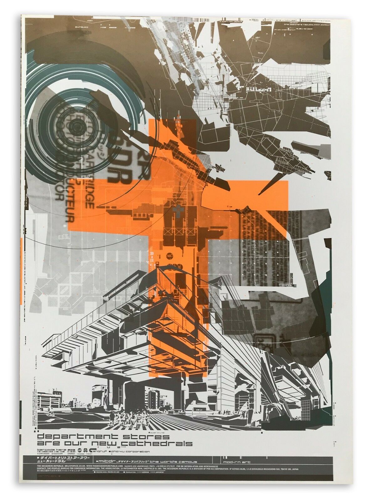
I think I needed to see those images. I needed to see that things could be clean and perfectly straight, but also layered and broken and echoing off into the distance. Where I thought that I hated texture, I loved this texture. There was so much to look at, a lot of it completely meaningless, but it filled the frame in a pleasing way.
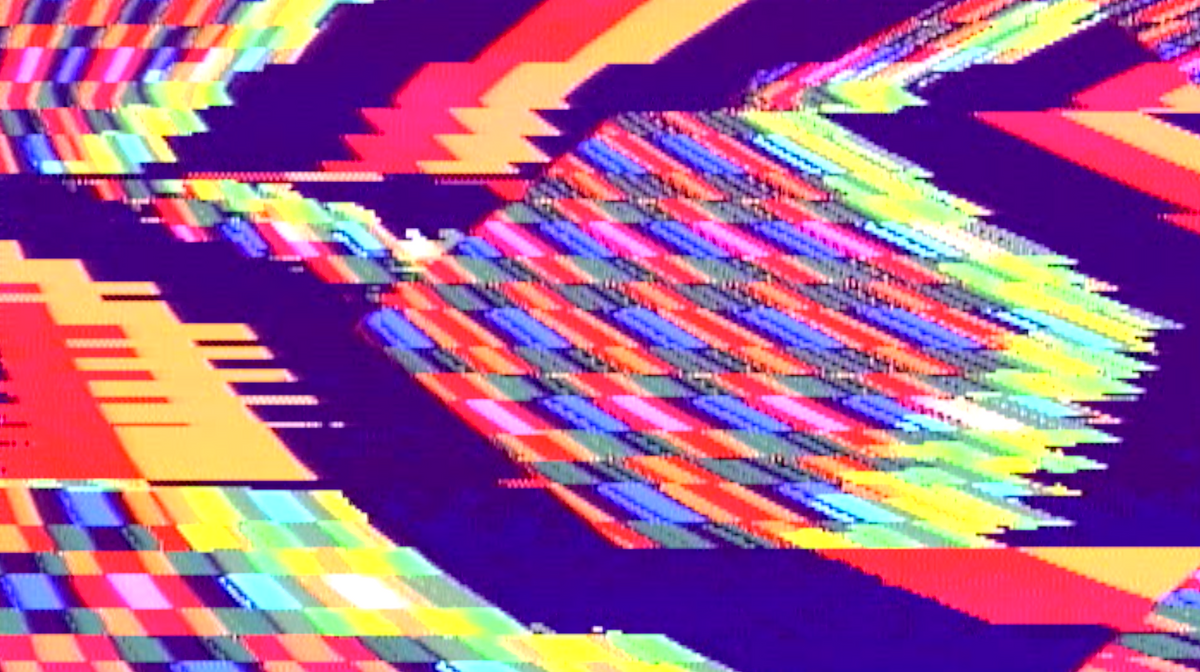
When I started working with modular video synthesis, I was still working through some of these issues with imperfection. It's analog, there are inherent imperfections. You dial in a black screen only to find that there are subtle ripples of color and texture. You make a simple diamond on the screen only to find that there's a wobble near the peaks. Colors bleed into each other and mix like light, rather than paint.
But that is the point. If I were drawing a diamond in Illustrator, would I have given it a wobble near the peaks? How do you approximate feedbacking color bleed in Photoshop? What do I type into Stable Diffusion to give my video the look of using unshielded RCA cables?
Video synthesis has a character; is a character.
This isn't an analog or digital argument. Of the four digital video mixers I own, each one has a specific character that it imparts to video. This is even more pronounced when working with feedback.
If anything, it's a use-the-right-tool-for-the-job argument. I happen to like my modular video synthesis workflow and the results I get from it. But if I'm looking to make a composition that scales infinitely up or down with edges that stay clean in any resolution, there's Illustrator. After Effects. Touch Designer. Hell, bring the work from those tools into the video synth to impart some texture, then cut it all up in After Effects and run it through again.
Nothing will ever be perfect. I can't make art like I work at NIST, I'd go insane. But I can embrace imperfections and run with it.