Breakdown: George Barber's Tilt

One of my personal goals for 2023 is to create longer-form video. I've been working in 15 second chunks for years and it feels like the next step is to have a coherent piece that works over the span of a couple minutes.
As part of this process, I'm going back and analyzing video art pieces that I really like, breaking them down, and trying to figure out if there's any lessons I can pull from them for my own work. First up: George Barber's Tilt.
Background & Context
George Barber is a British video artist. In the mid-80s he was part of Scratch Video; a relatively short-lived video art movement that took the sampling concepts from hip hop and applied it to video, creating works with rapid edits, heavy use of keying and early digital mixer effects, often in an overtly satirical or political manner.
On the American side of the Atlantic, later in the early 90s, Emergency Broadcast Network was doing something similar. Their Commercial Entertainment Product VHS was where I was introduced to the style:
Barber's other works at the time were similar collages of existing materials, some more processed than others. In 2023, they approach something like fan edits or Corecore, though they lean much heavier on satire, humor, and irony than earnestness.
His more recent works are still satirical and political, including a video about a sentient Predator drone.
The Video
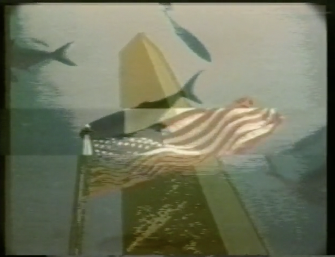
The video is 5 minutes of very processed clips of the 1984 Los Angeles Olympics and documentaries about the American west. It is soundtracked by an uncredited Forevereaction track called U People (Dance mix). The video makes sense with the music, but is also not cut to it. Unlike other Scratch pieces from the time–which could feature incredibly rapid cuts–Tilt has a relatively moderate editing pace.
The effects on the clips are a mixture of animated keys, solarization, freeze frames, reduced frame rates, keying a clean portion of the video, and lots of layering.
There is very little by way of an intro or outro. The clip starts and ends with the music. Two seconds into the piece, there is an artist credit, but no title card. In many ways, it feels like jamming out on a video mixer, but a highly composed, thoughtfully edited jam.
Maybe it's because it uses clips from the Summer Olympics, but the overall tone of the video, to me, is "summer". It's lots of shots of nice weather, people on beaches, swimming, amusement parks. The music is upbeat. Even if the piece is pulling from a lot of disparate sources, working within a particular season gives it an inherent cohesion.
Throughout the piece there are solid-colored animated keys dancing through the layers of video. They're wiggling sine waves and grids of squares, and jittering rectangles. At times it seems like they are moving to the music. The presence of these keys through most of the clips also help tie the clips to one another.
Tilt feels complete. It says what it needs to say in five minutes and change and doesn't overstay its welcome.
Lessons
Okay, so what can I pull out of Tilt to use in my own work?
I think a large part of the cinematic progression is because of the soundtrack. The song starts simply, builds a bit and then ends. The early parts of the video feel like the beginning to the video because the soundtrack says as much. The video compositions don't get notably more complex as the song builds, though your ear may tell your eyes that they are.
I think it also helps that the song used is relatively unknown. In researching this post, I watched another Scratch Video piece that used New Order's Blue Monday as a score, and that felt much more like a music video than maybe it was intended to. If you are going to have the audio guide the video progression, it might help if the viewer does not have any prior associations with the music (unless that is part of the point).
Best I can tell, Tilt was constructed from a series of video mixer jams: Play a tape, mess with it in a video mixer, record the output. Sometimes, feed the results back into the mixer and record again. All of those output tapes were then stitched together with the song laid over top.
As someone that really dislikes the editing process, this is one method that I can get behind. It's a rather random process, but if the original content has a theme ("summer") and there are cohesive elements like the dancing hard keys, then doing these random splices could work.
I could see myself mining my video sketchbook for themes ("diamonds", "checkerboards", "blue") and constructing a longer form video out of random splices from those elements.
A final lesson relates to the sampling nature of Scratch Video: use elements that the audience is familiar with. Yes, this is in opposition to what I said above about song selection, but I am trying to avoid an overt music video feeling.
I think that Tilt might work so well for me because I am an American and the clips speak to a certain Americanness that I can identify with. As a Brit, Barber may be poking fun at those tropes (or not), but the effect is the same to me. The Grand Canyon, the Washington Monument, hanging out at the beach, cowboys, amusement parks; all of that is instantly recognizable to me. Those things are mixed in with elements that are much more abstract, where it is not clear what is going on. But the recognizable elements keep your brain engaged.